Flaconi - Increasing cart revenue by reducing checkout friction
ROLE: Lead UX Designer
DATE: March 2021 – January 2023
SUMMARY
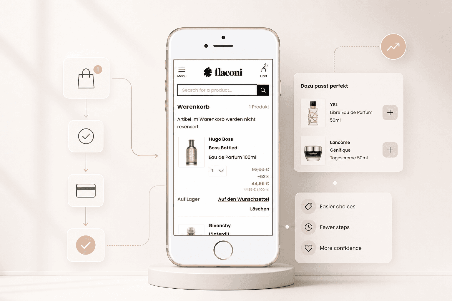
At Flaconi, I worked across multiple parts of the e-commerce experience, including replatforming, cart and checkout, PDPs, account services and product recommendations. One of the strongest commercial wins came from improving how recommended products worked inside the cart.
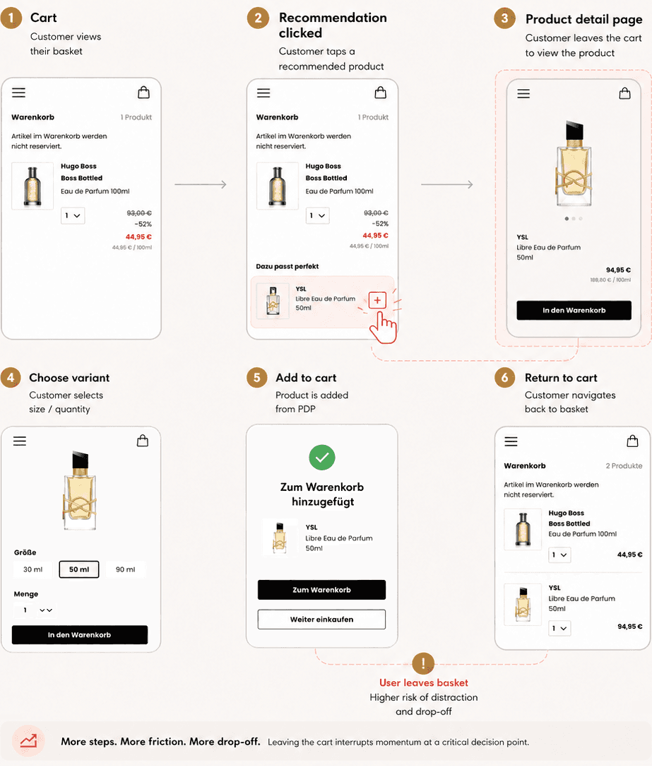
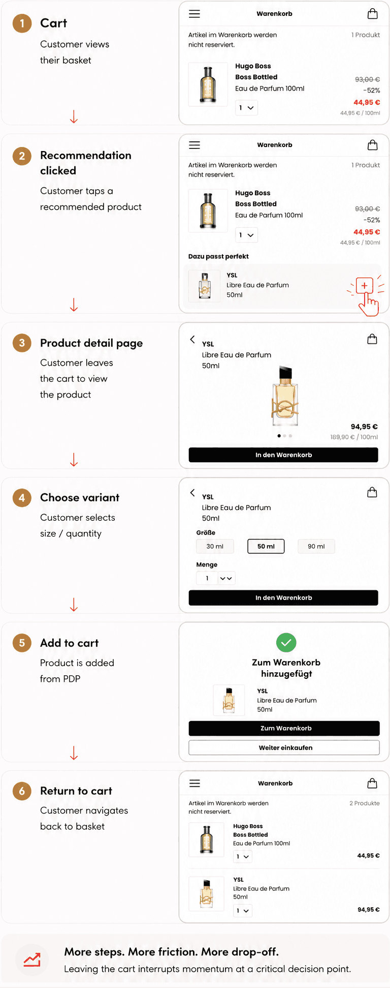
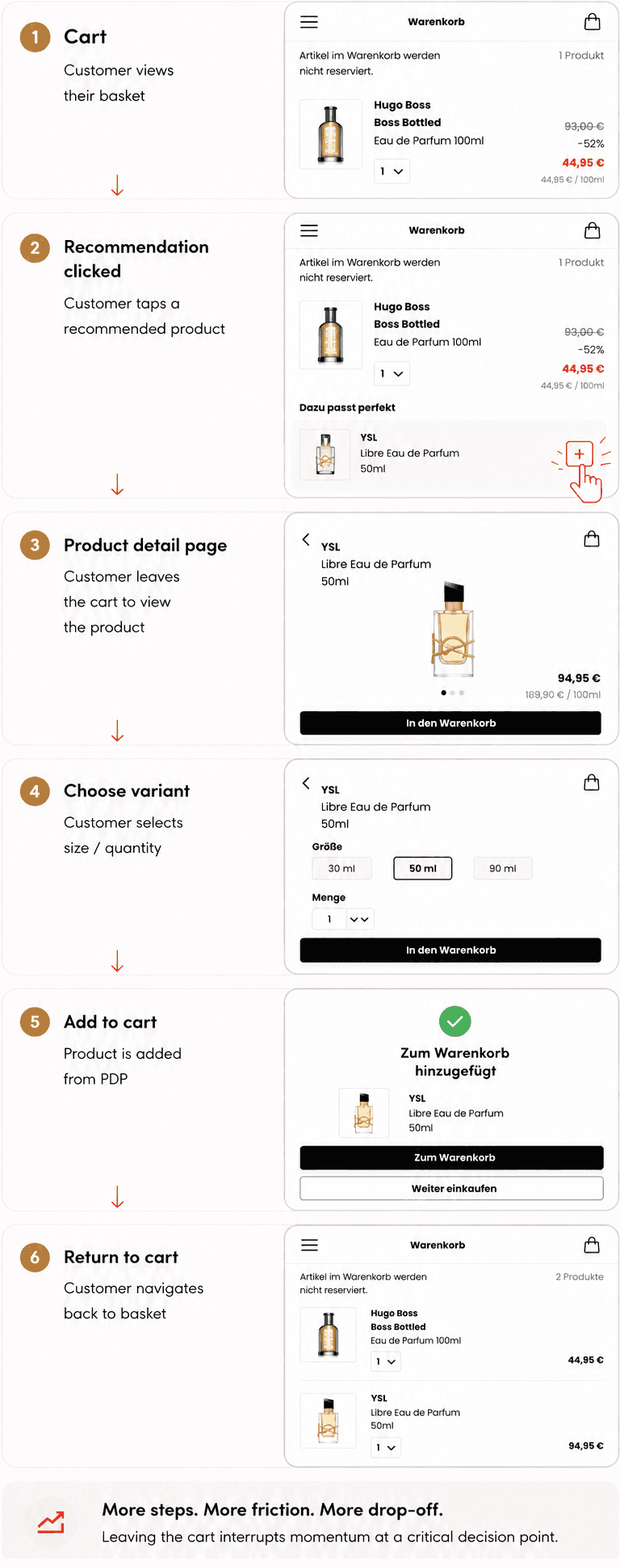
I identified that recommended products were being surfaced at the right moment, but the interaction model was wrong. Clicking a recommendation took customers out of checkout and back to the PDP to choose a variant, interrupting momentum at a critical point in the funnel and increasing the likelihood of cart abandonment.
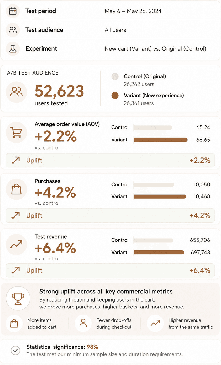
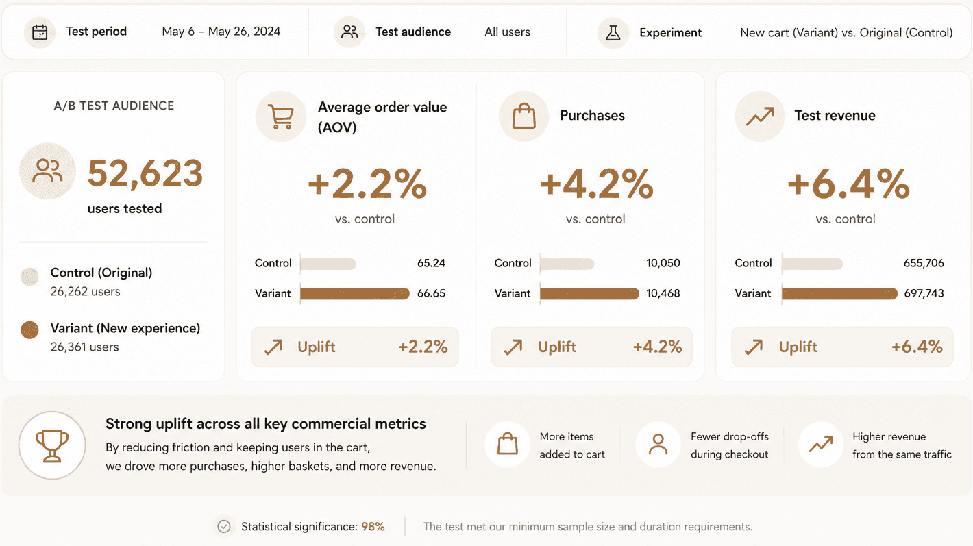
I redesigned the component so customers could choose variants directly in the cart, then validated the change through A/B testing. Across 52k+ users, the new pattern increased AOV by 2.2%, purchases by 4.2%, and test revenue by 6.4%.
THE CHALLENGE
This project sat at the intersection of two important e-commerce goals: keeping checkout fast and uninterrupted, while also increasing basket value through recommended products.
The existing recommendation pattern supported the second goal, but undermined the first. If a user clicked a recommended product, they were taken away from the cart and back to the PDP to choose a variant before they could add it. That added friction at exactly the point where the experience should feel most streamlined.
This was especially relevant in beauty retail, where recommended products often require a variant choice such as:
colour or shade for makeup
size or volume for perfume
The recommendation strategy itself was sound, but the interaction cost of acting on it was too high.
BEFORE
Fragmented add-to-cart flow
Customers leave the basket to view product details, choose a variant, and add to cart — creating friction and increasing drop-off risk.
WHAT I CHANGED
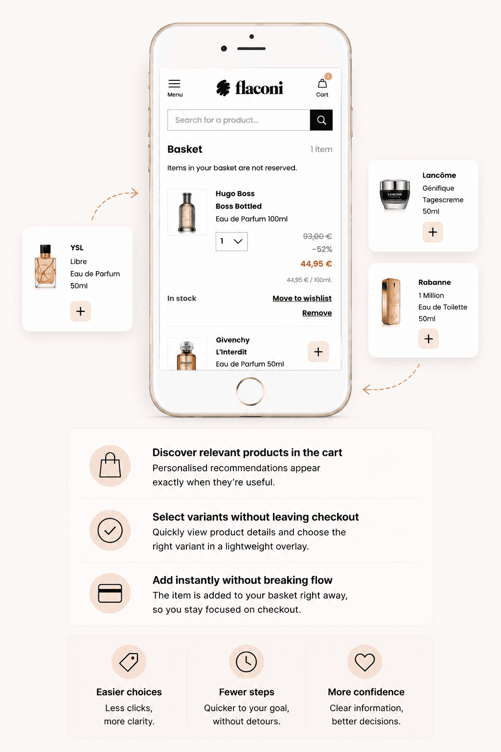
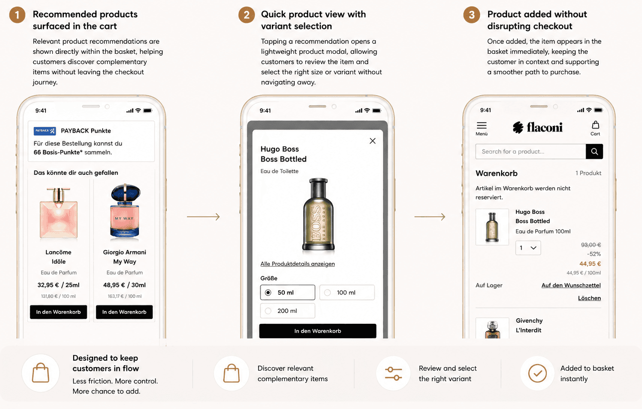
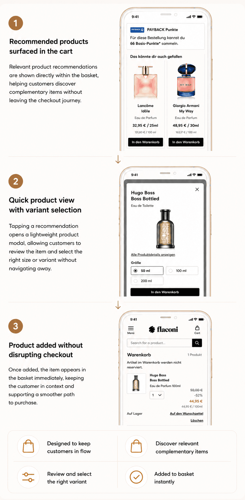
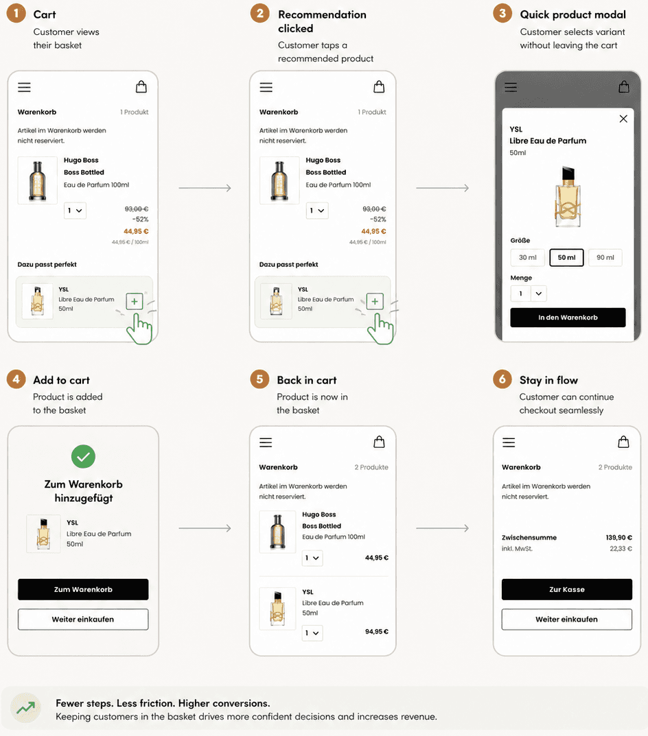
Redesigned the recommendation pattern so customers could select the right variant directly within the cart instead of leaving checkout.
The new component allowed users to:
choose a variant in context
add the product immediately
stay inside the checkout journey
This turned the recommendation module from a detour back into browsing into a lightweight inline upsell pattern that better matched the pace and intent of checkout.
WHY IT WORKED
Redesigned the recommendation pattern so customers could select the right variant directly within the cart instead of leaving checkout.
The new component allowed users to:
choose a variant in context
add the product immediately
stay inside the checkout journey
This turned the recommendation module from a detour back into browsing into a lightweight inline upsell pattern that better matched the pace and intent of checkout.
OUTCOME
Redesigned the recommendation pattern so customers could select the right variant directly within the cart instead of leaving checkout.
The new component allowed users to:
choose a variant in context
add the product immediately
stay inside the checkout journey
This turned the recommendation module from a detour back into browsing into a lightweight inline upsell pattern that better matched the pace and intent of checkout.
WHAT THIS SHOWS
Strong product thinking in a commercial e-commerce environment
The ability to identify high-impact friction in a checkout journey
UX decisions grounded in customer behaviour and business outcomes
A focused design change validated through experimentation