FINTECH
Designing accessible banking experiences across app, web and wearable
INTRO
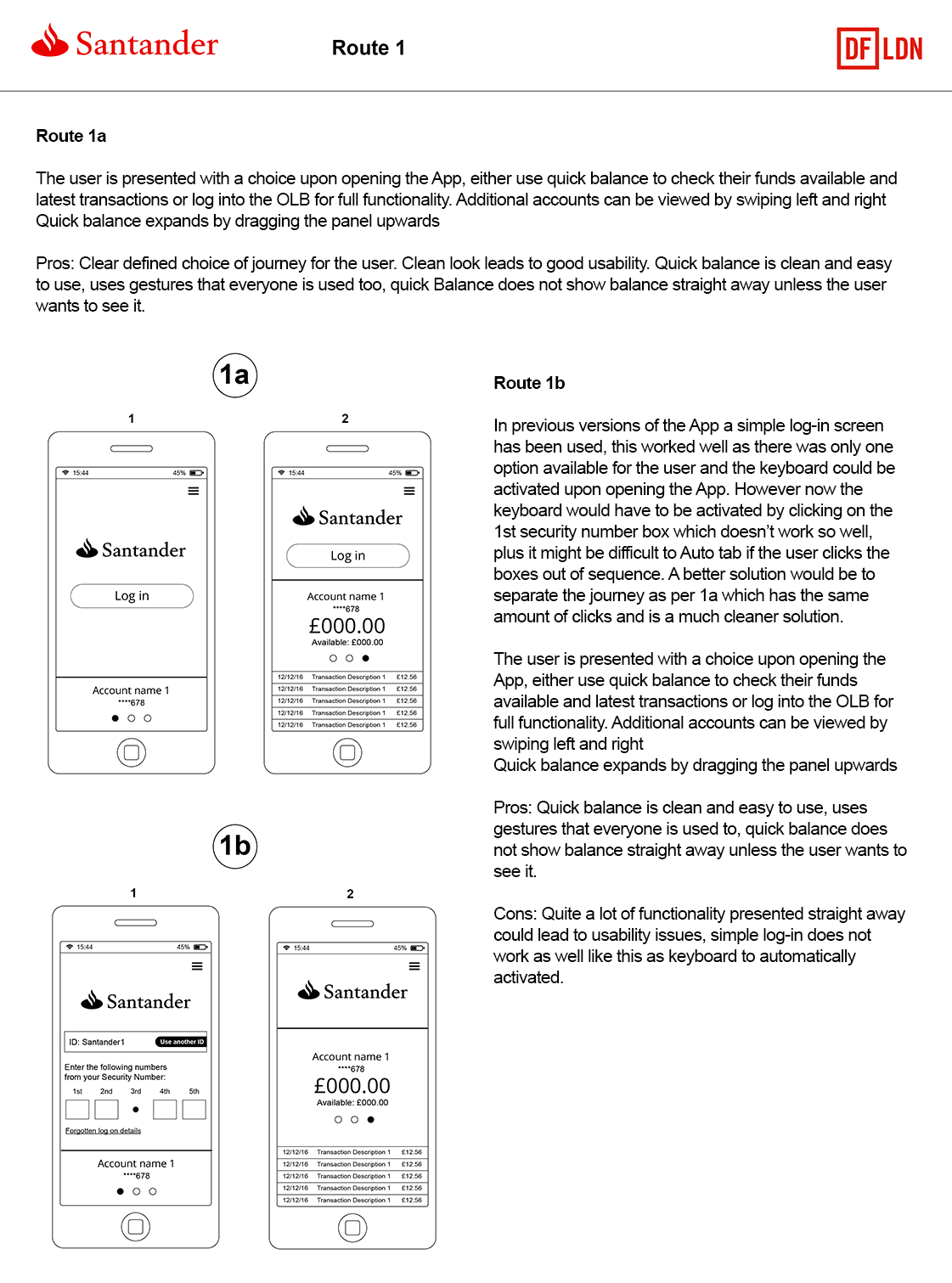
I worked on a range of Santander digital products, helping improve banking journeys across responsive web, native app and smartwatch experiences. My role covered UX, UI, accessibility and design systems, with a focus on making complex banking tasks clearer, more consistent and easier to use.
ROLE: Lead UX Designer
DATE: June 2014 – November 2015
OVERVIEW
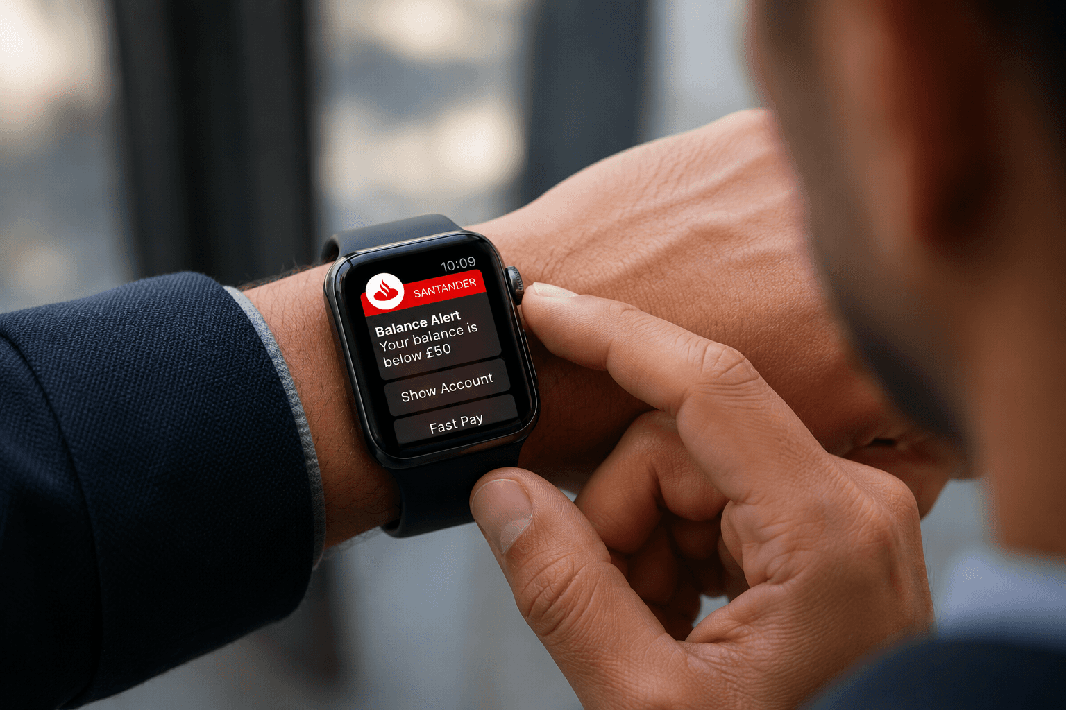
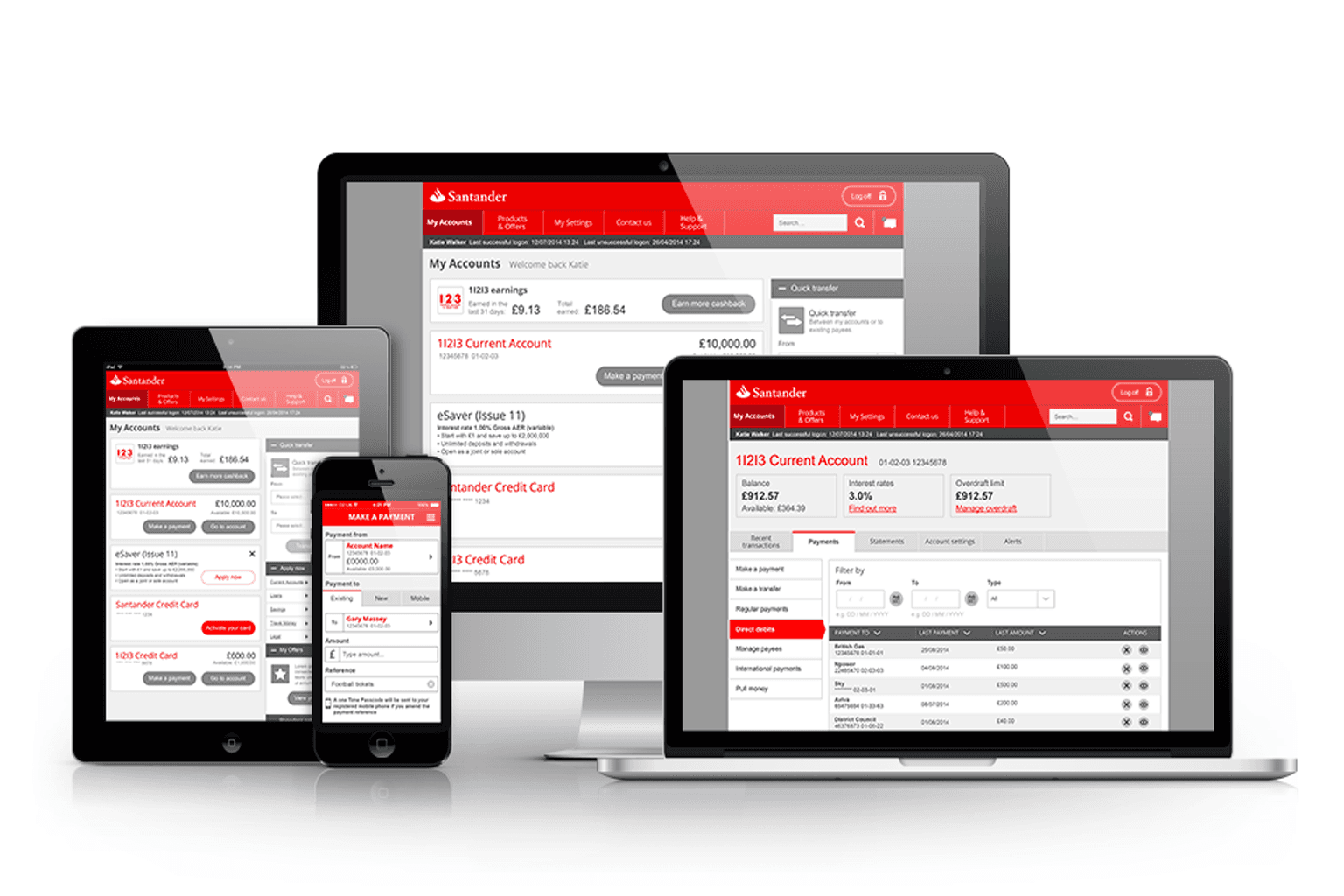
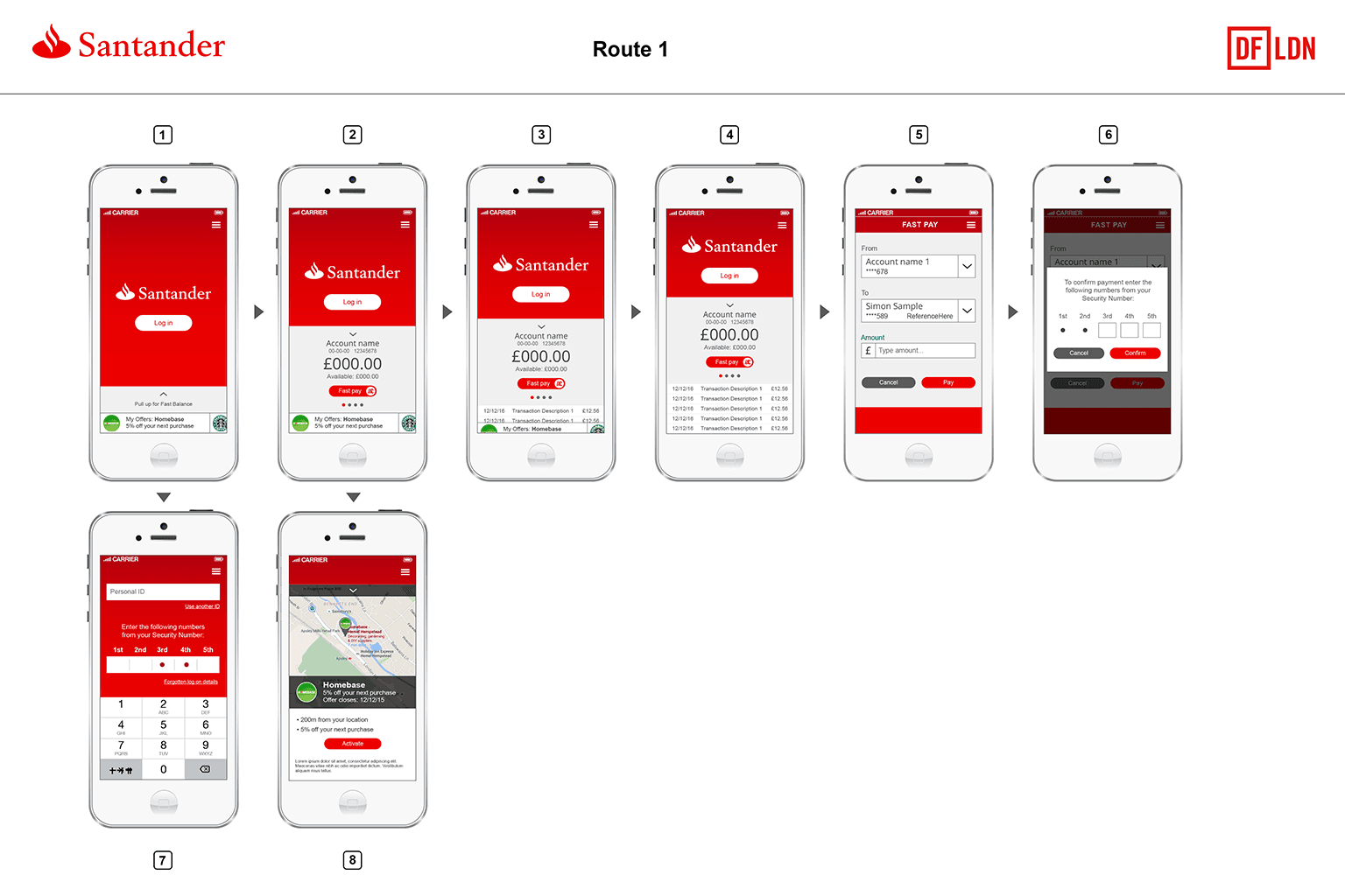
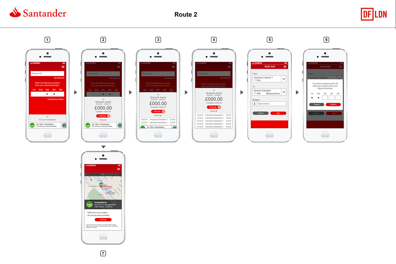
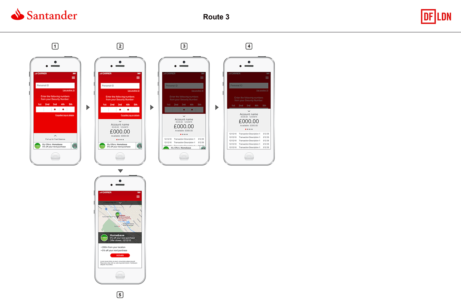
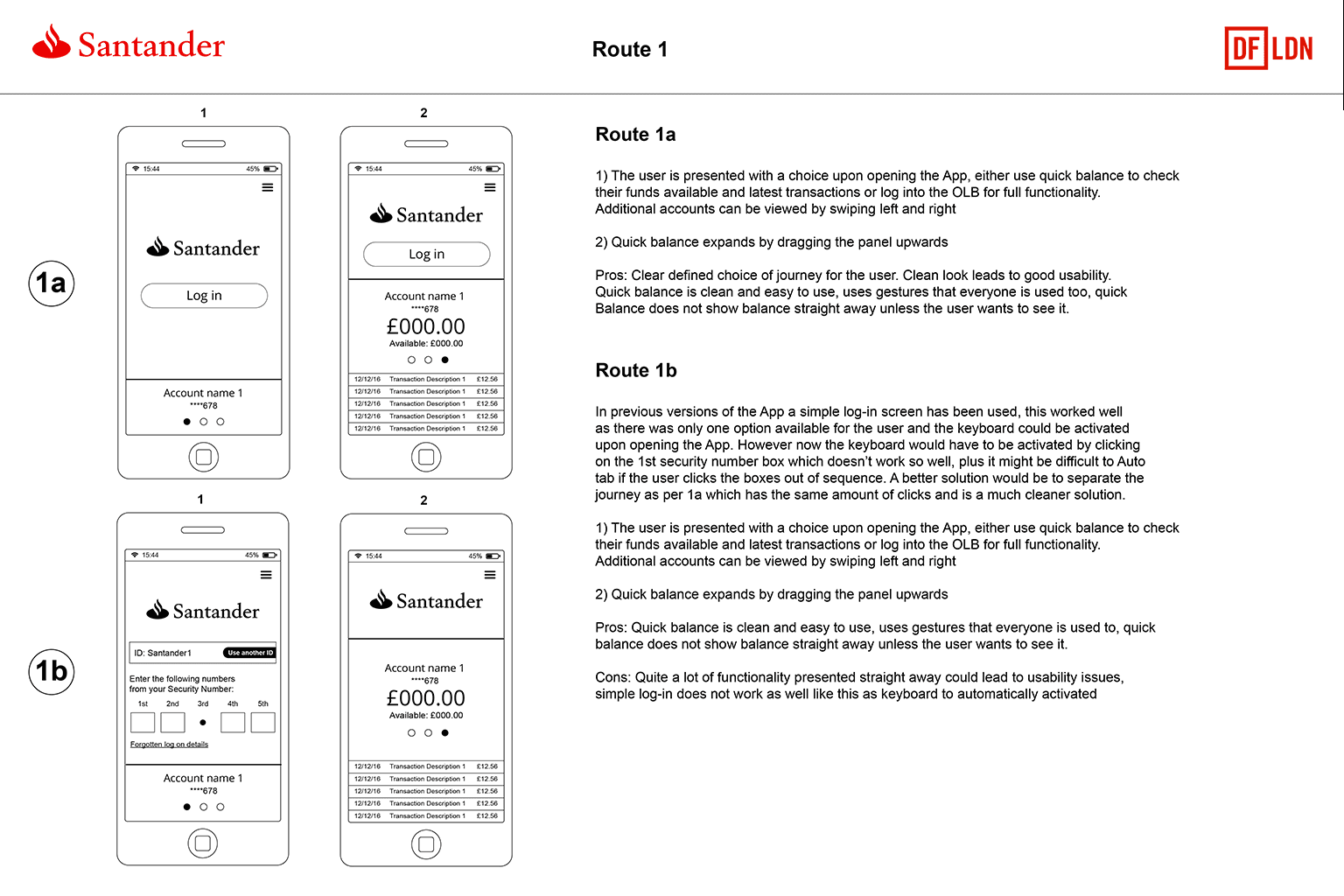
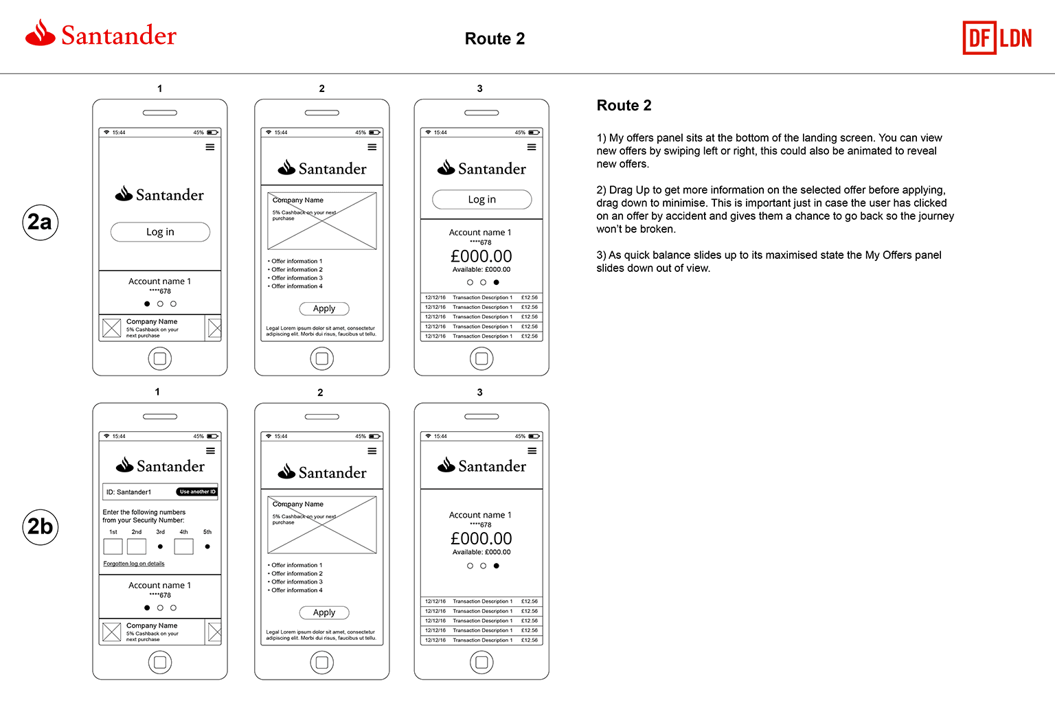
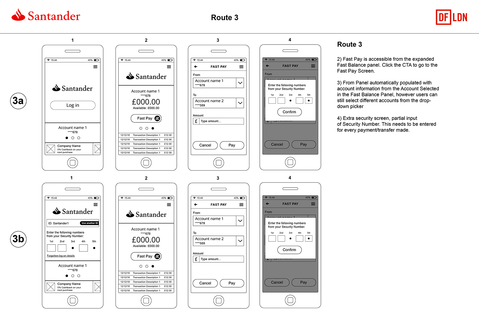
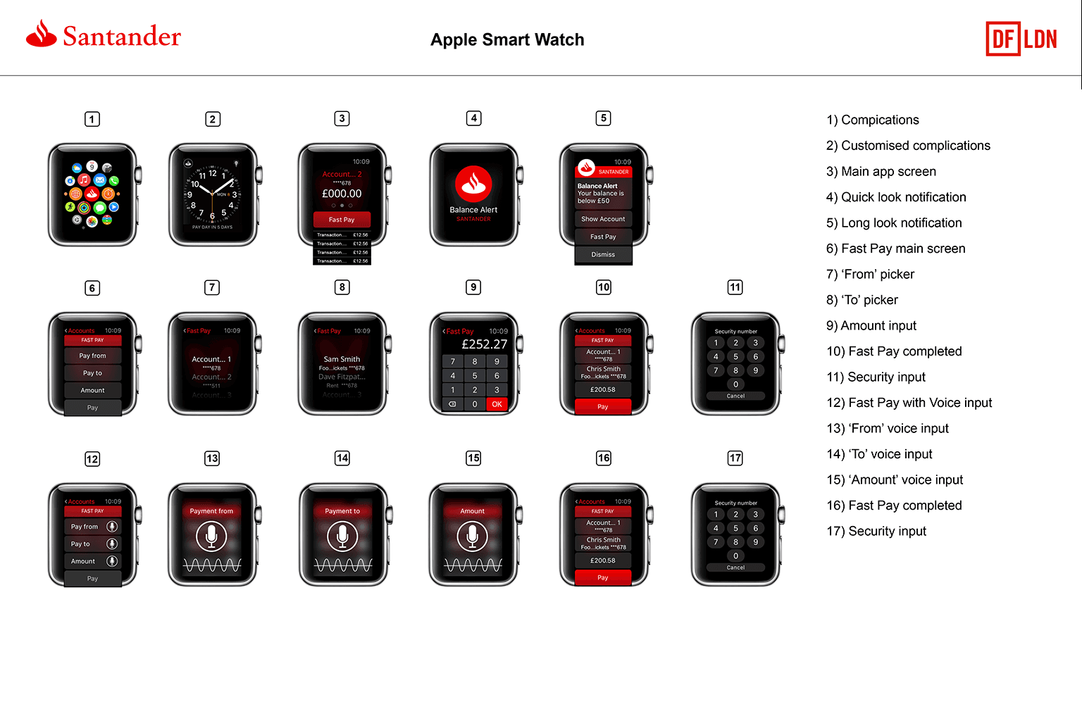
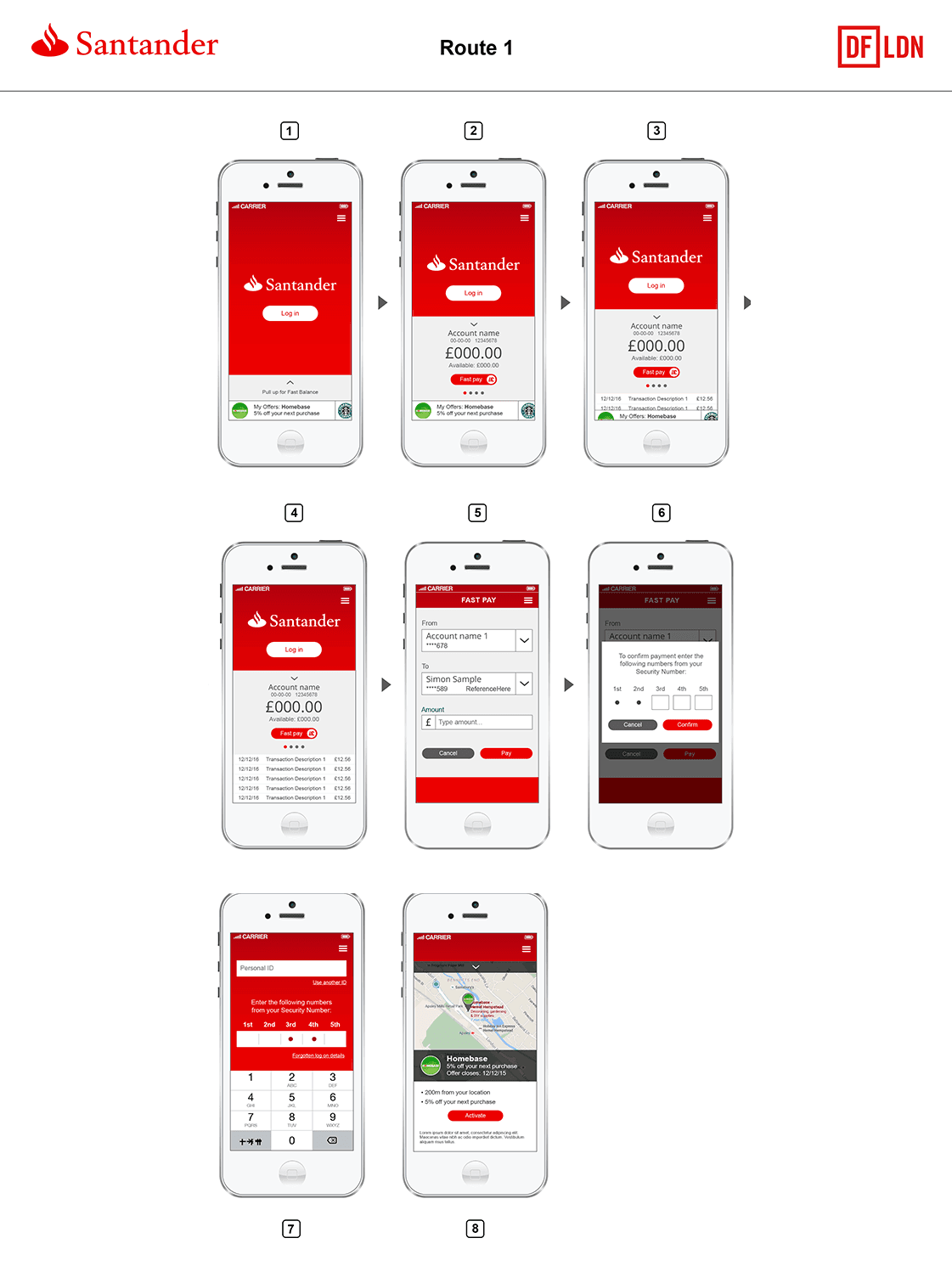
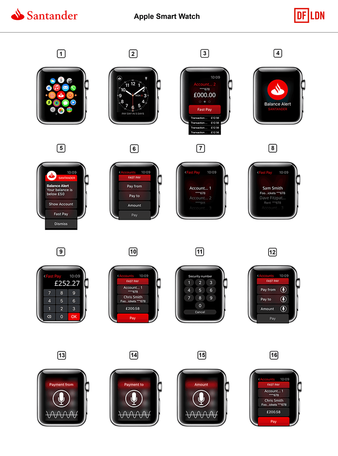
This was broad product design work across multiple customer touchpoints rather than a single flow. Projects included fast balance, smartwatch banking, new payee and standing order journeys, responsive online banking templates and accessibility improvements. I also created digital style guides for Santander’s responsive site, native app and forms to improve consistency from design through to build.
WHAT I WORKED ON
Led the Santander design team across multiple UX and UI projects
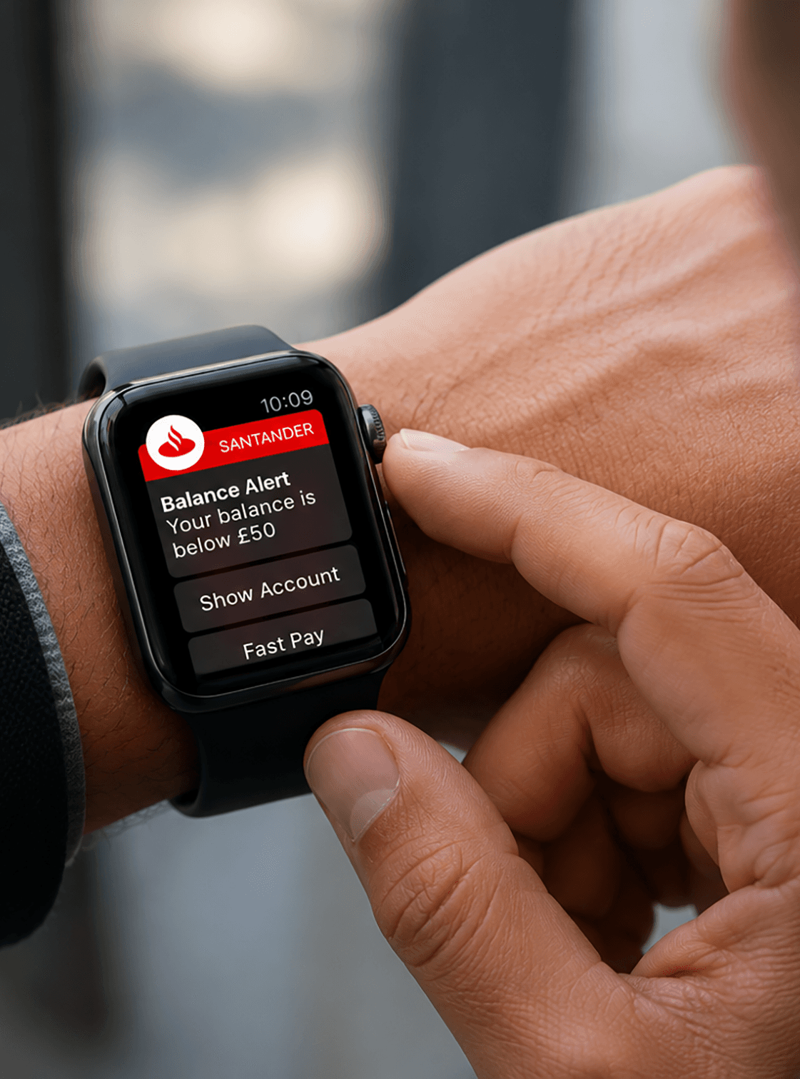
Designed fast balance and smartwatch banking experiences
Worked on app expansion for new payees and standing orders
Developed responsive templates, navigation and components for Santander’s online bank
Reworked payments and standing orders using behavioural data from Santander’s website
Supported accessibility improvements to help Santander meet DDA AA standards
Carried out accessibility testing through DAC and created a colour contrast matrix using Santander brand colours
Produced digital style guides for app, responsive site and forms
Worked closely with Santander’s CX team in a client-facing role, with regular meetings and presentations
THE CHALLENGE
Banking journeys often carry a lot of complexity, especially around payments, standing orders and account management. The challenge was to simplify those interactions without losing important controls, while also making the experience more consistent across different platforms and more accessible for a wider range of users.
APPROACH
Where formal user research was limited, I used quantitative behavioural data to understand how customers were actually interacting with the product. On payments, the data showed that most payments were not regular, and that regular payments were usually monthly with no end date. That insight informed a progressive disclosure approach, revealing extra options only when users needed them and keeping the default path simpler for the majority.
Alongside this, I created reusable templates, components and style guides to improve consistency across channels and make design decisions easier to carry through into delivery. This matters in your portfolio because it shows not just screen design, but how you made a complex product more coherent at system level.
ACCESSIBILITY
A significant part of the work focused on accessibility. I worked with Santander to improve compliance, tested products through DAC, and created a colour matrix using Santander’s brand palette so teams could quickly identify combinations that met WCAG contrast requirements.
WHY IT MATTERS
This work helped make everyday banking tasks easier to complete across multiple devices and contexts. It also strengthened accessibility and consistency across Santander’s digital estate, helping teams move beyond loose brand guidance towards clearer digital patterns and more reliable user experiences.
OUTCOME
The project resulted in improved banking journeys across responsive web, app and wearable touchpoints, stronger accessibility foundations, and reusable style guide assets for future delivery. It also gave Santander clearer digital patterns for payments, navigation, forms and account interactions across products.